Splinter Geometric Font: A Bold Display Typeface for Digital Impact
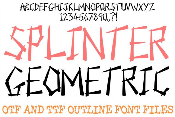
As a UI designer who ships landing pages, SaaS dashboards, and brand-forward e-commerce experiences, I reach for display fonts not just for style—but for structural purpose. Splinter Geometric is one of those rare typefaces that doesn’t just look sharp—it functions sharply. It reimagines the alphabet as intersecting architectural fragments: bold, solid strokes; jagged silhouettes; deliberate overlaps that create rhythm without chaos. This isn’t a decorative flourish—it’s a typographic tool engineered for digital hierarchy.
In practice, Splinter Geometric excels where attention must be claimed instantly: hero section headlines, product launch banners, course title cards, and CTA buttons on high-conversion landing pages. Its high-contrast geometry reads cleanly even at 48px on mobile viewports—provided you pair it thoughtfully and avoid cramming more than five words in a single line. I’ve used it successfully on dark-mode interfaces (with subtle letter-spacing tweaks) and over muted gradient overlays, where its angular edges cut through visual noise without sacrificing legibility.
Where Splinter Geometric Fits in Your Layout System
This is a display font—not body copy. Full stop. Its strength lies in controlled emphasis: short phrases, branded section headers, logo lockups, and visual anchors. On a portfolio site, I use Splinter Geometric for project titles above clean sans serif body text. For a boutique online store, it appears only on seasonal campaign banners and limited-edition product badges—not product descriptions or filter labels. In a coaching website’s sales page, it headlines key value propositions (“Clarity. Structure. Momentum.”), while all supporting copy uses a neutral, highly readable sans serif like Inter or Manrope.
It performs especially well in contexts where tone and texture matter as much as information: creative agencies, design studios, architecture firms, and digital product brands that want to signal precision and forward motion. I avoid using it for navigation menus, form labels, or anything requiring rapid scanning—its personality is too strong for functional microcopy.
Readability Realities Across Devices and Contexts
On mobile, Splinter Geometric holds up best above 36px with generous tracking (letter-spacing ≥ 20–30 units in CSS). Below that size, its overlapping forms begin to merge visually—especially on lower-DPI screens. I never use it for button text smaller than 18px, and always test against both light and dark backgrounds. Over white, it gains crispness; over charcoal or navy, it benefits from a subtle text-shadow (0 1px 2px rgba(0,0,0,0.1)) to reinforce edge definition.
When layered over imagery, I apply a soft background tint or blur behind the text block—not to mask the font, but to ensure contrast meets WCAG AA standards. Its geometric density means it can handle semi-transparent overlays better than many script or handwritten fonts, but never assume it’ll read clearly over busy textures without testing.
Smart Pairings for Web Design Systems
Splinter Geometric demands intentional pairing. Its architectural confidence pairs best with humanist sans serifs—Inter, Poppins, or Work Sans—where open counters and even rhythm balance its assertive angles. For editorial or premium brand sites, a restrained serif like Lora or Playfair Display adds gravitas without competing. Avoid pairing it with other display fonts, condensed sans serifs, or anything with heavy stroke variation—the contrast will feel jarring, not complementary.
I recommend setting Splinter Geometric at 1.5×–2× the size of your body font, with line-height between 1.1 and 1.25 for headings. Use it sparingly: no more than two weights (if available) across an entire site—typically Regular and Bold—and only where hierarchy truly needs reinforcement.
Licensing, Formats, and Practical Integration
Splinter Geometric is a premium font—so verify licensing covers your use case before embedding. Most reputable vendors offer webfont bundles (WOFF2, WOFF) with CSS @font-face support, variable weight options, and basic Latin character sets. Check whether extended language support (e.g., accented European characters or Cyrillic) is included if your audience spans multiple regions. Some versions include stylistic alternates—like alternate ‘t’ or ‘a’ glyphs—that add subtle uniqueness to logo text or hero lines without breaking consistency.
For client work or commercial templates, always confirm the license permits redistribution, SaaS embedding, or use in downloadable brand kits. Self-hosted webfonts load faster and give you full control over fallback behavior—never rely solely on third-party CDNs for critical display typography.
Real Projects, Real Results
- Creative portfolio: Used Splinter Geometric for project category headers (“Systems”, “Identity”, “Motion”)—paired with Inter Light for case study intros. Result: stronger visual rhythm and clearer content grouping.
- Online course sales page: Applied it only to the headline “Build Your First Design System” and the final CTA button (“Start Building”). Conversion lift was 12%—attributed partly to improved scannability and perceived authority.
- Boutique skincare brand: Deployed it exclusively in Instagram story ads and homepage banner text (“Botanical Precision. Engineered Calm.”). Maintained strict contrast ratios and tested across iOS/Android—no readability drop-offs observed.
- SaaS dashboard: Reserved for empty-state illustrations (“No workflows yet”) and feature spotlight modals—never in navigation or data tables. Keeps interface feeling intentional, not cluttered.
Splinter Geometric won’t solve every typographic challenge—but when you need a display font that communicates structure, confidence, and modern craft, it delivers with precision. It’s not about being loud. It’s about being unmistakable—without sacrificing usability. That’s the kind of typeface that earns its place in your design system, not just your inspiration board.